Ranking San Diego Padres uniforms from worst to best

(Photo by Sean M. Haffey/Getty Images)
2 of 4
Next
(Photo by Sean M. Haffey/Getty Images)
(Photo by Sean M. Haffey/Getty Images) /

My wife strongly disagrees with me, but I think the San Diego Padres have the best collection of uniforms in all of Major League Baseball.

(Seriously, as a Chicago native, I bought a Jake Arrieta All-Star Game jersey five years ago and, to this day, she loathes whenever it makes an appearance. Brown and gold just don’t do it for her).

But now that I cover the Padres and see the uniforms on a near-daily basis in one way or another, I thought it would be fun to take a quick look at the full rundown of options Fernando Tatis Jr. and Manny Machado don every week.

Now, this is set up as a worst-to-best rankings, but in all honestly, I don’t think there’s a bad option here. It’s just drop-dead gorgeous swagger, 162 times a year with some bonus fire come October. Let’s dive in.

Padres Uniforms: #4 Camouflage Armed Forces

The Padres have a long-standing tradition of supporting the armed forces with camouflage uniforms. The design of those jerseys has changed over the years – with the latest featuring two distinct looks.

The first features a green urban camouflage print and the second utilizes sand-olive in more of a desert-vibe look. Both uniforms showcase the American flag on the left sleeve and the Swinging Friar on the right. Of course, San Diego is a major hub for the armed forces and you can often see United States Marines at Petco Park on game day.

While this is a really cool tradition and something that stands out when looking at the 30 MLB teams and their uniforms, for me, they just lack the cleanness and simplicity that make the team’s three primary looks so strong.

Mandatory Credit: Cary Edmondson-USA TODAY Sports
Mandatory Credit: Cary Edmondson-USA TODAY Sports /

Padres Uniforms: #3 Alternate Tan Pinstripes

Pinstripes till I die. As a lifelong Cubs fan, I can’t help it.

San Diego’s alternate tan uniforms with pinstripes and ‘San Diego’ emblazoned across the chest are a whole mood. Like I said, yes, I’m ranking these, but there are only winners on this list.

It’s nice to have a different option for home games besides your home whites. These feel drastically different than the bright whites the Friars rock most of the time at Petco and the piping is a subtle, but absolutely on-the-money move in a nod to the past.

Pulling off a full suite of uniforms in brown and gold is no easy feat. But the Padres have done it perfectly, and their tan alternate uniforms are no exception. They take colors from a bygone era and somehow make them feel modern and swaggy. The type face for the ‘San Diego’ is edgy and clean and the pinstriped pants are what dreams are made of.

I don’t have anything bad to say about this look. Maybe there’s just a little too much tan when you’re going head-to-toe in one look – but that comes down to personal preference in the end.
(Photo by Ronald Martinez/Getty Images)
(Photo by Ronald Martinez/Getty Images) /

Padres Uniforms: #2 Brown Roads

Let road grays die in a ditch somewhere. They’re old, tired and belong in the trash.

More from Friars on Base

Bring in the bold, colorful road uniforms that give fans a stark contrast to the home whites. It’s what the people want – and, thankfully, the Padres understand that. Their brown road uniforms mean business and are very nearly my favorite uniforms in all of baseball.

In this uniform, it’s all in the details. The subtle white outline around the gold ‘San Diego’ across the chest, the Swinging Friar patch on the shoulder and the gold piping on the sleeves. Don’t even get me started with what high Stance socks add to this look because it’s almost too much to handle.

Seriously. The fact that San Diego can rock an all-brown uniform and still somehow be the best-looking squad in baseball is amazing. Inject more bold colors and powerful simplicity into uniforms around the game, Rob Manfred. You talk a good talk about letting the kids play, but leaning more into fun color combinations like the Padres’ brown road look would let us all know you actually care about the future of baseball and injecting some fun back into the game.

(Photo by Matt Thomas/San Diego Padres/Getty Images)
(Photo by Matt Thomas/San Diego Padres/Getty Images) /

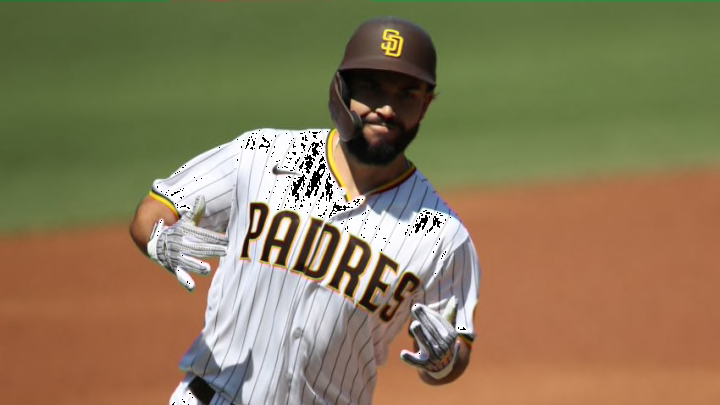
Padres Uniforms: #1 White Pinstripes

White pinstripes are life.

Best jersey in baseball and I’m not afraid to say it. This checks every box for me. The cleanliness of the white, the perfect accents of brown and gold in the trim on the sleeves and collar. The loud, resounding ‘Padres’ across the chest.

Seriously, this is what uniforms are supposed to look like.

This look is a statement. It sends a message: the San Diego Padres are hear to humiliate you, dominate you in every way. Friar Faithful who wear this uniform do so proudly, with dreams of hoisting a World Series championship banner at Petco Park in the near future.

It’s built for bat flips, bat slams and an energy other teams just can’t match. It’s running toward the future while respecting all that came before. It’s a new era in Padres baseball and the game, as a whole.

Three closers not named Josh Hader the Friars could target. dark. Next

Let me know your thoughts on Twitter. Always interested to hear what you all think and which uniforms are your favorite. One thing’s for sure though. Brown and gold reign supreme.

Next