%20%20--%3E%0A%3Csvg%20version%3D%221.1%22%20xmlns%3D%22http%3A%2F%2Fwww.w3.org%2F2000%2Fsvg%22%20xmlns%3Axlink%3D%22http%3A%2F%2Fwww.w3.org%2F1999%2Fxlink%22%20x%3D%220px%22%20y%3D%220px%22%0A%09%20viewBox%3D%220%200%20975.8%20200%22%20style%3D%22enable-background%3Anew%200%200%20975.8%20200%3B%22%20xml%3Aspace%3D%22preserve%22%3E%0A%3Cstyle%20type%3D%22text%2Fcss%22%3E%0A%09.st0%7Bfill%3A%23231F20%3B%7D%0A%09.st1%7Bfill%3A%232F241D%3B%7D%0A%09.st2%7Bfill%3A%23FFC425%3B%7D%0A%09.st3%7Bfill%3A%23FFFFFF%3B%7D%0A%09.st4%7Bfill%3Anone%3B%7D%0A%09.st5%7Bfill%3A%23E55301%3B%7D%0A%3C%2Fstyle%3E%0A%3Cg%20id%3D%22Template%22%3E%0A%3C%2Fg%3E%0A%3Cg%20id%3D%22Layer_2%22%3E%0A%09%3Cpolygon%20class%3D%22st2%22%20points%3D%22158.4%2C158.6%20191%2C158.6%20191.3%2C52%20158.4%2C52%20%09%22%2F%3E%0A%09%3Cpath%20class%3D%22st2%22%20d%3D%22M382.3%2C52c-13.7%2C0.2-27.8%2C5.9-37%2C20.5V53.6h-32.4v105h32.4v-45.2c0-31.5%2C28.8-30.8%2C37-30.8V52z%22%2F%3E%0A%09%3Cpath%20class%3D%22st2%22%20d%3D%22M438%2C93.5c-7.5-2.6-19.2-4.6-19.2-11.4c0-3.5%2C3-6.2%2C10.3-6.2c10%2C0%2C21.5%2C6.8%2C24.6%2C11.2l21-13.4%0A%09%09C469.1%2C63%2C453.8%2C52%2C430.3%2C52c-22.4%2C0-42.9%2C9.4-42.9%2C31.6c0%2C22.6%2C28.5%2C29.7%2C36.1%2C32.3c7.5%2C2.6%2C19.4%2C4.6%2C19.4%2C11c0%2C4.8-4.1%2C7-12.1%2C7%0A%09%09c-11.9%2C0-24.4-9.9-26.2-14.5L382.3%2C134c5.2%2C11.9%2C21.5%2C24.6%2C48.2%2C24.6c26.9%2C0%2C43.8-11.2%2C43.8-32.7C474.3%2C103.9%2C445.8%2C96.2%2C438%2C93.5z%0A%09%09%22%2F%3E%0A%09%3Cpath%20class%3D%22st2%22%20d%3D%22M262.2%2C53c-3.9-0.8-8-1.3-12.3-1.3c0%2C0-0.1%2C0-0.1%2C0c0%2C0-0.1%2C0-0.1%2C0l0%2C0c-30.8%2C0.1-52.5%2C22.3-52.5%2C53.5%0A%09%09c0%2C30.5%2C21.8%2C53.5%2C52.7%2C53.5c8.6%2C0%2C16.6-4.4%2C23.5-7.7v7.7H306l0.2-53.5C306.2%2C78.3%2C287%2C58.1%2C262.2%2C53z%20M249.8%2C128.3%0A%09%09c-13.2%2C0-21.8-10-21.8-23.2c0-13.1%2C8.6-22.9%2C21.8-22.9c13%2C0%2C21.4%2C9.8%2C21.4%2C22.9C271.2%2C118.3%2C262.8%2C128.3%2C249.8%2C128.3z%22%2F%3E%0A%09%3Cg%3E%0A%09%09%3Cg%3E%0A%09%09%09%3Cpath%20class%3D%22st3%22%20d%3D%22M174.8%2C35.6c-4.4%2C0-8.5%2C1.2-12.1%2C3.2c-1.1%2C0.6-2.1%2C1.4-3.1%2C2.2c4.1%2C3.5%2C9.4%2C5.7%2C15.3%2C5.7s11.2-2.1%2C15.3-5.7%0A%09%09%09%09c-1-0.8-2-1.5-3.1-2.2C183.4%2C36.8%2C179.3%2C35.6%2C174.8%2C35.6z%22%2F%3E%0A%09%09%3C%2Fg%3E%0A%09%09%3Cg%3E%0A%09%09%09%3Cpath%20class%3D%22st3%22%20d%3D%22M174.8%2C11c4.4%2C0%2C8.5-1.2%2C12.1-3.2c1.1-0.6%2C2.1-1.4%2C3.1-2.2C186%2C2.1%2C180.7%2C0%2C174.8%2C0s-11.2%2C2.1-15.3%2C5.7%0A%09%09%09%09c1%2C0.8%2C2%2C1.5%2C3.1%2C2.2C166.3%2C9.9%2C170.4%2C11%2C174.8%2C11z%22%2F%3E%0A%09%09%3C%2Fg%3E%0A%09%09%3Cg%3E%0A%09%09%09%3Cpath%20class%3D%22st3%22%20d%3D%22M174.8%2C30.7c5.8%2C0%2C11.1%2C1.7%2C15.7%2C4.5c1%2C0.7%2C2%2C1.4%2C3%2C2.2c3-3.9%2C4.7-8.8%2C4.7-14c0-5.3-1.8-10.1-4.7-14.1%0A%09%09%09%09c-0.9%2C0.8-1.9%2C1.5-3%2C2.2c-4.5%2C2.9-9.9%2C4.5-15.7%2C4.5c-5.8%2C0-11.1-1.7-15.7-4.5c-1-0.7-2-1.4-3-2.2c-3%2C3.9-4.7%2C8.8-4.7%2C14.1%0A%09%09%09%09c0%2C5.3%2C1.8%2C10.1%2C4.7%2C14c0.9-0.8%2C1.9-1.5%2C3-2.2C163.7%2C32.4%2C169.1%2C30.7%2C174.8%2C30.7z%22%2F%3E%0A%09%09%3C%2Fg%3E%0A%09%3C%2Fg%3E%0A%09%3Cg%3E%0A%09%09%3Cpath%20class%3D%22st3%22%20d%3D%22M527.6%2C74.2c35.2%2C0%2C40.2%2C15.7%2C40.2%2C26.3v2.1c0%2C10.5-5%2C26.6-40.2%2C26.6h-3.4c-35.1%2C0-40.1-16.1-40.1-26.6v-2.1%0A%09%09%09c0-10.6%2C5-26.3%2C40.1-26.3H527.6z%20M525.9%2C89.9c-13.7%2C0-17%2C6-17%2C11.1v0.9c0%2C5.2%2C3.6%2C11.6%2C17%2C11.6s17-6.3%2C17-11.5v-1%0A%09%09%09C542.9%2C95.9%2C539.3%2C89.9%2C525.9%2C89.9z%22%2F%3E%0A%09%09%3Cpath%20class%3D%22st3%22%20d%3D%22M598.6%2C75.2l27.6%2C26.8V75.2h24v53.1h-24.4l-30.3-29.1v29.1h-24V75.2H598.6z%22%2F%3E%0A%09%09%3Cpath%20class%3D%22st3%22%20d%3D%22M676.8%2C75.2h54.7c15.9%2C0%2C19.9%2C5.9%2C19.9%2C12v0.6c0%2C6.3-5.5%2C9.6-10%2C10.5c5.9%2C1.1%2C13.1%2C4.4%2C13.1%2C13.9v0.7%0A%09%09%09c0%2C8.4-5.5%2C15.5-22.9%2C15.5h-54.8V75.2z%20M700.9%2C88.2v6.2h21c3.8%2C0%2C5.1-1.1%2C5.1-3.1v-0.1c0-2.1-1.3-3-5.1-3H700.9z%20M700.9%2C107.1v7.7%0A%09%09%09h22.2c4.9%2C0%2C5.9-1.9%2C5.9-3.9v-0.1c0-2.1-1.1-3.6-5.9-3.6H700.9z%22%2F%3E%0A%09%09%3Cpath%20class%3D%22st3%22%20d%3D%22M807.6%2C120.9h-28.3l-3.3%2C7.4h-24.3l25.6-53.1h33.3l27.2%2C53.1H811L807.6%2C120.9z%20M793.2%2C89.9l-7.4%2C16.4h15%0A%09%09%09L793.2%2C89.9z%22%2F%3E%0A%09%09%3Cpath%20class%3D%22st3%22%20d%3D%22M833.8%2C110.6V110h27.6c0.1%2C2.5%2C1.3%2C6.5%2C10.6%2C6.5h0.3c8.6%2C0%2C10.3-2.1%2C10.3-4.3v-0.1c0-2.1-1-4-11.1-4.3%0A%09%09%09l-10.6-0.3c-21.3-0.6-26.3-8.1-26.3-16.5v-0.6c0-9.4%2C7.1-16.1%2C32.3-16.1h7.9c27.6%2C0%2C33.9%2C7.9%2C33.9%2C16.7v0.5h-27.1%0A%09%09%09c-0.1-1.9-1.2-4.9-10.2-4.9H871c-8.3%2C0-9.4%2C1.4-9.4%2C3.4v0.1c0%2C2.1%2C1.9%2C3.4%2C10.9%2C3.6l10.1%2C0.2c20.5%2C0.5%2C28.1%2C5.4%2C28.1%2C16.2v1%0A%09%09%09c0%2C9.2-5.6%2C18.3-34.8%2C18.3h-8.1C836.9%2C129.3%2C833.8%2C117.5%2C833.8%2C110.6z%22%2F%3E%0A%09%09%3Cpath%20class%3D%22st3%22%20d%3D%22M975.5%2C75.2v14.1h-38v5.2h37.4v13.9h-37.4v5.8h38.3v14.2h-62.1V75.2H975.5z%22%2F%3E%0A%09%3C%2Fg%3E%0A%09%3Cpath%20class%3D%22st2%22%20d%3D%22M115.4%2C72.5V53.6H83v105h32.4v-45.2c0-31.5%2C28.8-30.8%2C37-30.8V52C138.7%2C52.2%2C124.5%2C57.9%2C115.4%2C72.5z%22%2F%3E%0A%09%3Cpath%20class%3D%22st2%22%20d%3D%22M76.9%2C78V53.6H54.8v-5.7c0-8.4%2C4.3-12.6%2C12.8-12.6h11.9l25.1-25.1v0H79.4H57.1c-23.3%2C0-34.9%2C12.3-34.9%2C35.6%0A%09%09v7.8H0V78h22.1v80.6h32.6V78H76.9z%22%2F%3E%0A%3C%2Fg%3E%0A%3C%2Fsvg%3E%0A)

Losing Our Identity

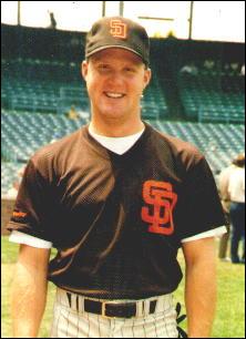
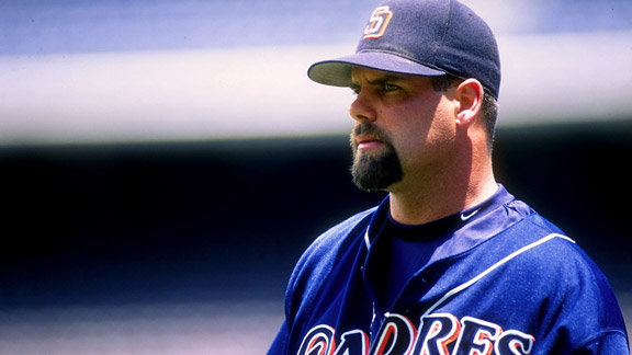
The recent throwback night at PETCO Park revived a topic many people gripe about, but never seem to actually want to try and fix – OUR CURRENT UNIFORMS ARE TERRIBLE. Over the summer this has seemed to be a hot topic (Pun intended – I know, a pun so early? Yes.), as many blogs, ESPN, and even Tony Gwynn have announced their desire to return to the stitching of yesteryear.
Now don’t get me wrong, we don’t have the ugliest uniforms in Baseball. That honor belongs to the Marlins and Astros, respectively. And, they did do away with that awful sand uniform we fielded, over which I hope someone, somewhere was fired…twice.
Regardless, the Padres are putting on some terrible looking jerseys these days! At some point some person looking to make their job relevant decided we should look like pretty much half the teams in Baseball. We shouldn’t have any real discerning ‘look’ to set us a part or color wheel that might give us an identity. The Marlins uniforms are literally the worst I’ve ever seen, but hot damn you know when they’re coming to town! So, why can’t our uniforms be changed? Or, changed back? It shouldn’t be that mind-blowing as it’s extremely apparent that no one likes what’s currently happening, and our camouflage jerseys just might be the worst idea of all time. After decades the Chargers finally listened and went back to the powder blues. Is it too much to ask our new owners to take a look at this issue and possibly give the fans what they want? I don’t think so. The only problem now is to find out what it is the fans really do want.
The first fan I asked has not only been championing this issue by himself, he’s an ex-Padre and current Padres color guy sitting next to the legend Dick Enberg, Mark “Mudcat” Grant!
Me: What was your personal favorite Padres uniform, and why?
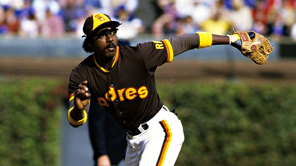
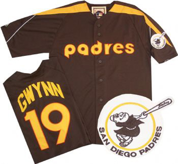
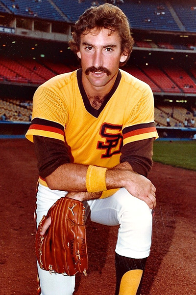
Mud: I love the ones we wore back in 1989. I think they could make some variations to it to really make it look cool. The brown is synonymous with Padre baseball, I believe. When you turn on the tube and see those colors, there’s no question, it’s Padres baseball! Gotta bring back the white spikes also!
Me: What do you think about the current Padres uniform?
Mud: There are too many teams out there with similar primary colors. Gotta change it up.
You know what? Mudcat is right! When you think brown uniforms, whether you think it’s dirt brown or dookie brown or mud brown, it’s that brown that when it comes to Baseball can only be associated with Padres Baseball!
I wanted more. I wanted to see what other fans thought about it, so decided to spread my question to find out was their favorite Padres uniform and why? (Hint: none of them said 2012.)
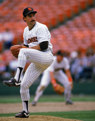
“Definitely the ’84 Padres for me. I remember being in Texas as a kid, and seeing them on baseball cards and being fascinated with the colors, the design, and wondering what the hell a Padre was.”
-Woods, FM94/9 Morning Show
“Half of MLB teams use blue. I hate it. When you look at a game and can’t tell the difference between the Padres and Los Doyers something is very wrong. Here.”
– Travis Russell, Baseball Podcast Producer and Christian Youth Theatre Megamind
“Ahhhh, Taco Bell brown.”
– Adam Gimbel, Local Musician
“As great as the brown and orange is, I’d settle for more throwback nights in the season + the ’98 colors as the regulars. It was our last great team, and even better: they were the colors we had when the O’Malley’s last owned the Dodgers.”
– Josh Elwell, Writer, The Kept Faith
“84’ or nothing. Those are the only ones that blend the awful colors with a good design. Unis have been terrible since they added blue.”
– Joe Chandler, Writer, The Midnight Show
It seems like every person I asked wants a return to any uniform from 1984-1998 and you know what? I can’t disagree! How could I? Whatever has happened since moving into PETCO has been mistake after mistake after mistake. Why were these decisions made? Why did we need to change the uniform to something so bland, so vacant of personality, so…blah. When you go to the stadium the clear absence of current jerseys being worn in the crowd is astounding. Not only do we have to compete with the opposing teams fans painting the stands with their colors, we have our own fans sporting the cloth of old, basically drowning out any attempt at uniformity. It’s a silent but monetary protest that speaks the will of the fans louder than a bullhorn in a tunnel. If the fans, and pros and players and media all prefer one style of your uniform, then it might be economically sound to placate them. Not only does our organization routinely release a frustrating product on the field, they do it off the field and in the team store as well.
I’ll be amazed if the Padres decide that it is truly time to bring back the brown and gold, or orange and brown, or orange and brown and blue. But, with new owners in place, who seem to be keen on turning around the fortunes of this team, the dream may just come true. The Padres for better or worse have and always will be synonymous with brown, so just give in. Give in to the brown.
For more Padres stuff and other things you might not care about follow me on Twitter @dallas_mc